Adaptive layout
You can perform adaptive layout in your application. When the same form looks different on various devices with wide screen (computer screen width is >= 998px) and mobile devices (smartphone screen width is < 998px). This functionality is supported by two tools:
- Writing additional styles applied in mobile layout only.
- Specifying for component in which mode (mobile or desktop) it will be rendered.
All tools are applied in component settings in the Style tab.
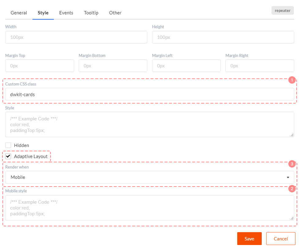
Tool 1. Additional style for mobile layout
To use this style check Adaptive layout checkbox in the Style tab. You will see Mobile style field in which you can write additional styles for mobile layout.
Tool 2. Rendering management
To use this style check Adaptive layout checkbox in the Style tab. Next select Render when property values. Three options are available here:
- Any - component will always be drawn.
- Mobile - component will be drawn only for mobile devices (smartphone screen width < 998px).
- Desktop - component will be drawn for wide screen devices only (computer screen width >= 998px).
Why do we need this? Well, not all components can be displayed in mobile layout with the help of styles. For example, we want to see grid on the wide screen and entity cards set on the mobile screen. Next start narrowing browser window horizontally. At some point grid will turn into cards set. It means that Grid View component is drawn for wide screen and Repeater for mobile mode.
The great advantage of this approach is that the component rendering is controlled by screen width. I.e. there will be only one heavy component in the form.