Builder
Form Builder Interface
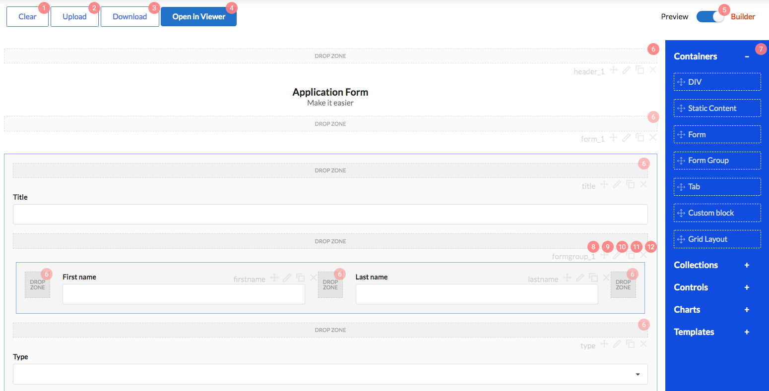
Form Builder interface has the following appearance:

Its control elements have the following functions:
- Form erasure, i.e., deleting all form elements.
- Form upload from JSON file.
- Downloading form layout as JSON file.
- Open the form in FormViewer for debugging.
- Toggle between form edit mode and form preview mode.
- Dropzones. You will drag and drop components from panel 7 to these zones, when editing a form.
- Component panel. Drag components from here to dropzones 6, when editing a form. We will define each component and its properties in documentation below.
Elements 8 - 12 are control menus for each component. There are similar component menus in forms.
- Displays component Name property.
- Control element with which you can drag component to any dropzone.
- Click this button to open property editing window for each component.
- Component copying button. Copied element will reserve all settings, but will have a different
Nameproperty value. - Click this button to delete component from form.
Component properties editing interface
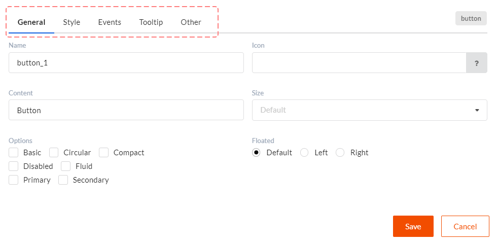
When clicking component properties editing button 10 component properties window will open. See picture below.

Some properties are unique for each component, some are general. All common properties are described here. All tabs divide component properties into the following groups:
- General - basic component settings which define its behavior and appearance.
- Style - component css styles settings.
- Events - defines which actions will be called upon certain component events.
- Tooltip - tooltips display settings. Tooltips are used as help and to display validation errors.
- Other - here you can set client validation, component visibility and component editability functions.
Component types
There are four basic component types.
- Containers - components which can contain other components. For example, tabs, forms and other layouts.
- Controls - form basic components. For example, inputs, dropdowns, headers, dictionaries.
- Collections - grid-like components which display multiple records.
- Charts - report display diagrams.
DWKitFormBuilder component
The form builder which allows you to create and change forms with Drag&Drop. Works in two modes - Preview and Builder.
import {DWKitFormBuilder} from "./scripts/optimajet-builder.js";

...

<DWKitFormBuilder
    actions={actions}
    getFormFunc={this.getForm.bind(this)}
    getFormList={this.getFormList.bind(this)}
    getAdditionalDataForControl={this.getAdditionalDataForControl.bind(this)}
    ref={(builder) => { this.builder = builder; }}
    templates={templates} />
/>
Parameters:
| # | Parameter | Type | Comment |
|---|---|---|---|
| 1 | actions | Array | List of actions for events |
| 2 | getFormFunc | function(name) { ... } | Callback function for getting source form by name |
| 3 | getAdditionalDataForControl | function(control, {startIndex, pageSize, filters, sort, model}, callback) { ... } | Additional data request. Used in pager controls, such as Dictionary and GridView. |
| 4 | localization | Object | Object with language constants for localization |
| 5 | templates | Array | Templates list |
| 6 | downloadUrl | string | The url for downloading files. Use for controls which operate files |
| 7 | uploadUrl | string | The url for uploading files. Use for controls which operate files. |